- All checklists
- Marketing
- Landing page checklist
Landing page checklist
A landing page checklist helps create effective pages that drive conversions by focusing on content, layout, visuals, forms, CTA buttons, and measuring results. It's ideal for marketers, business owners, and freelancers aiming to enhance user experience and conversion rates.

- Create a helpful, clear content
- Main and side headers
- Selling proposal
- Benefits
- Final argument
- Add cover photos from a design team
- Pay attention to the layout
- Include a note from an expert (if applicable)
- Feature a customer testimonial (if appropriate)
- Include product pictures
- Put product videos
- Present statistics from research
- Create comparison table
- Add FAQ section with Schema
- Add contact info (LiveAgent)
- Make use of quotes, lists, and other formatting tricks
- Design short forms
- Create compelling CTA buttons
- Be sure to proofread
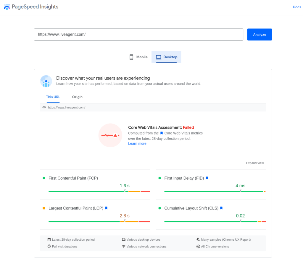
- Optimize page speed – Google Web Vitals
- Conduct responsivity optimization
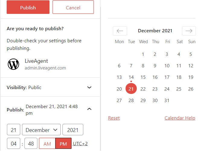
- Publish the content with CMS
- Promote the content
- Run A/B tests
- Measure results
Before launching a landing page, there are many different aspects to consider. This task can sometimes be overwhelming, but it’s vital to get the details right before people start visiting your page.
The following is a list of things to consider before creating your landing page. From copywriting and design elements to conversion rates and other measurements, this checklist will cover everything that you need to make your landing page successful.
What is a landing page checklist?
A landing page checklist is a great way to make sure you have all the bases covered before launching your website. Having one will help you uncover any bugs or missing elements before the landing page goes live, as well as prevent unexpected issues from occurring.
Why is a landing page checklist important?
It will help you get a clear idea of precisely what journey visitors take on your site. This will help you understand not just how long it takes to move down the landing page funnel, but also where potential conversions may fall out of it.
In addition to the benefits listed above, what else can you gain from a landing page checklist?
- Determine whether you successfully convert visitors into leads.
- Keep all steps of each process visible and prevent any possible confusion about what needs to be done next.
- Create an effective landing page that will drive conversions.
- Ensure that potential customers will have a great experience.
- Ensure that everything is covered before launching your website.
In contrast, if you decide to build a landing page without following a checklist then you can get stuck at a certain point, miss an essential element, or – worse still – fail to find opportunities for improvement.
Who can benefit from a landing page checklist?
Simply, anyone who wants to focus specifically on conversion:
- Email and pay per click (PPC) marketers
- Business owners
- Marketing managers
- Freelancers
In essence, anyone who wants to develop a cohesive, properly planned, and well-designed landing page without forgetting about anything important that might impact its future performance.
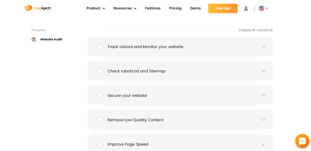
How to use a landing page checklist?
Below is a complete landing page checklist with all the items you need to consider when creating your landing page. Feel free to use this list as inspiration, adding or removing certain parts to tailor it towards your own needs and personal style.
Let’s start from the top and look at all of the elements that an effective landing page should include.
Content is the first thing people will see on your landing page. Therefore, it’s essential to make sure that it looks aesthetically pleasing and has a clear call-to-action (CTA) as well as an invitation to learn more.
What elements should you not overlook to ensure your landing page content is clear and easy to read?
The heading is the first text that your visitors see, so it’s one of your first opportunities to influence your conversion rate. Use a heading that clearly states the most considerable benefits that your product offers.
Headers are used to break up the page into more digestible chunks of information. You need to ensure that the main header is not too big and doesn’t take up too much space on the screen.
The side headers should explain what your landing page is about and why visitors would want to read on.
The selling proposal should include a specific value proposition. It also needs to be clear and easy-to-understand so that people will know precisely what they’ll get by purchasing your product or service.
It’s essential not just to say how it will improve their lives, but also why this improvement is valuable enough for the customer to want it. The selling proposal should be something that makes potential customers feel a sense of urgency, like an opportunity that they don’t want to miss.
Presenting benefits to visitors throughout your landing page is important because doing so will clearly show them how they can solve their problems and make a positive change. Show your product’s value in every section of your content so that the visitors will have no doubts that your product or service can change their lives for the better.
Present your target audience with a so-called value hierarchy, highlighting your product’s most beneficial feature first and least impactful aspect last.
The final argument needs to be compelling and should drive home the benefits of your product or service. This is important not just because it will convince people who are on the fence about making a purchase, but also because it reassures them that they’re making the right choice.
A final argument can have an impact on a buying decision, so make sure it’s strong enough to encourage people to take the desired action.
The cover photo is one of the most important visual aspects of a landing page. It’s going to be what captures people’s attention and persuades them to read on, so it should reflect your brand image while still being informative about what exactly your product or service does.
If possible, use high-quality images that are relevant to both you and your customers.
The layout should be clear and easy for visitors to navigate through. They must be able to see what you want them to without overwhelming them with too much information or a disorganized page.
Your website needs both a strong starting point and a clear path to follow through. Visitors should be encouraged to take appropriate action.
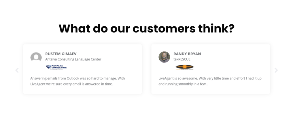
Adding a testimonial from an existing customer will increase trust with visitors. Make sure that your customers are willing to be public about their use of the product or service.
This is especially important if you are selling a service, because testimonials reassure visitors that someone else has already found your business worthwhile.
It’s important to let people see what exactly you’re offering. The pictures need to be high quality and highlight the products or services you offer.
In addition to choosing relevant photos, you should also select pictures that illustrate how an item would look if a customer was using it and what the quality is like.
Videos that demonstrate the benefits that your product can be highly influential. Viewers retain 95% of the information contained in videos.
Adding a product video will enhance the customer experience by making it easier for them to learn more about your products or services. In addition, it’s a more personable way to share a message and connect with prospective clients. Make a video that is inspiring and engaging.
Adding statistics from research studies will help to give your page more credibility. Numbers can be used as supporting evidence for the points you make and help potential customers understand what you’re selling.
Stats must come from reputable sources if visitors are to trust them.
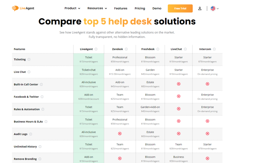
If your product or service is similar to others on the market, such a table can be helpful for people who want to compare them side-by-side. This will make it easier for visitors to see what differentiates you from others and why they should choose you over an alternative.
You can also use this section to compare your product or service to a competitor’s and show your unique selling point.
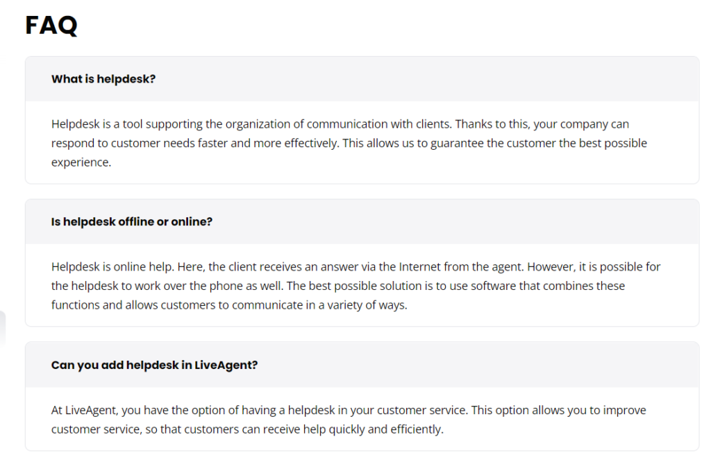
Adding an FAQ section will make it easier for people to find answers to their questions and understand what you’re offering. The questions must be written clearly so as not to confuse visitors while still being informative.
It’s also helpful if you use an FAQ Schema markup on this section to appear higher up in search rankings. This way, Google can better understand what is being asked as well as which answers correspond to those questions.
For any additional questions, your contact information should be clearly visible and easily accessible. People who visit your landing page shouldn’t have any problems with finding contact details.
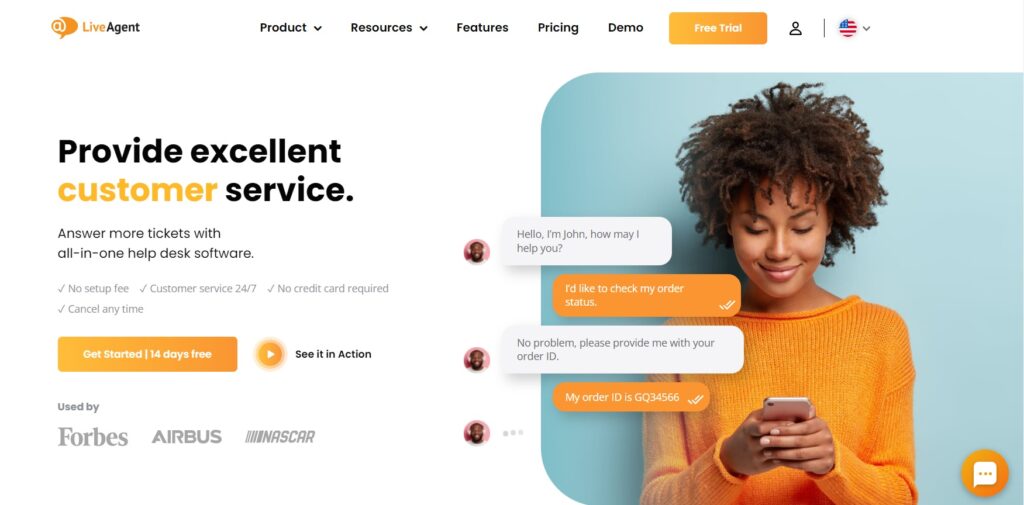
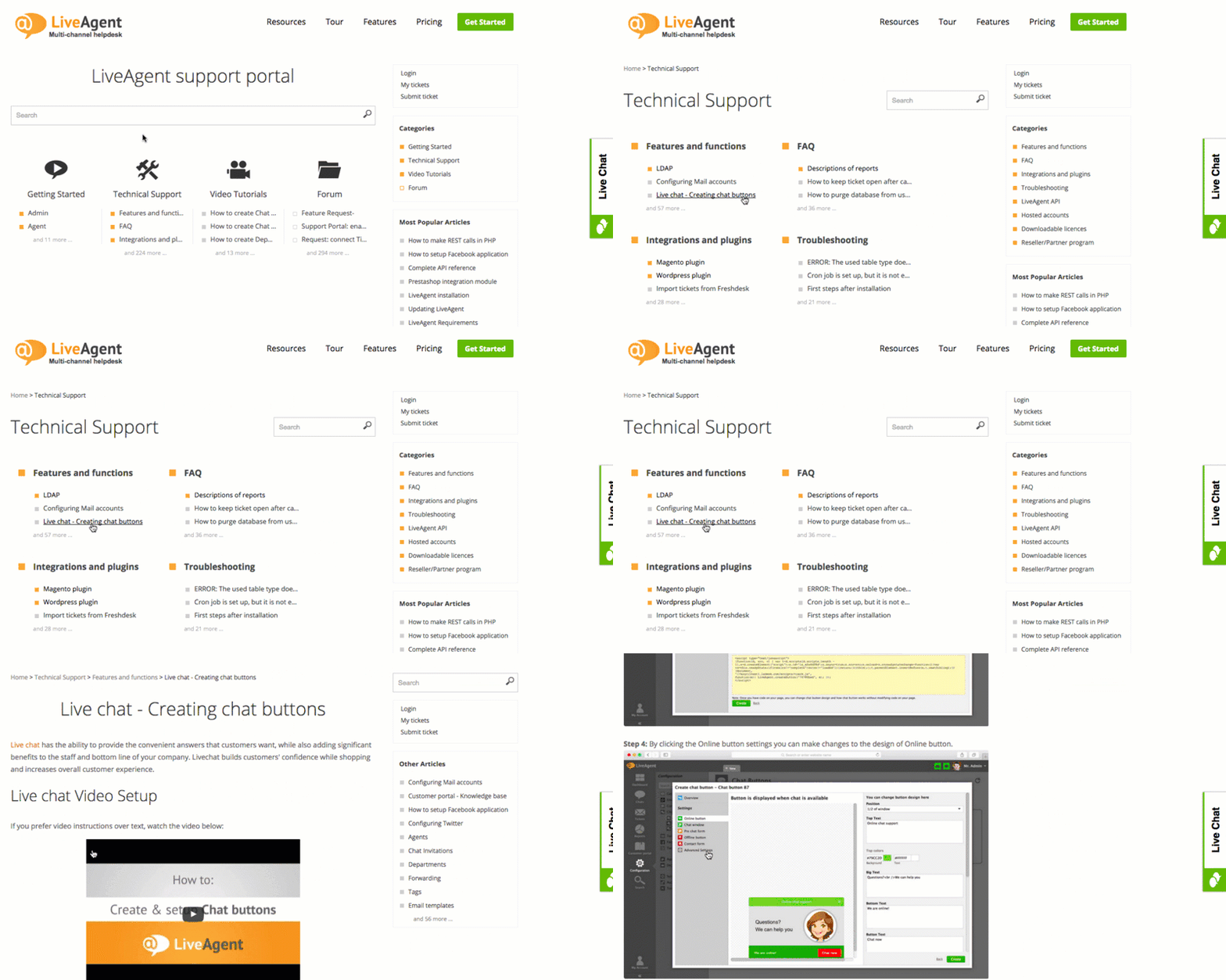
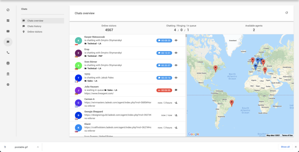
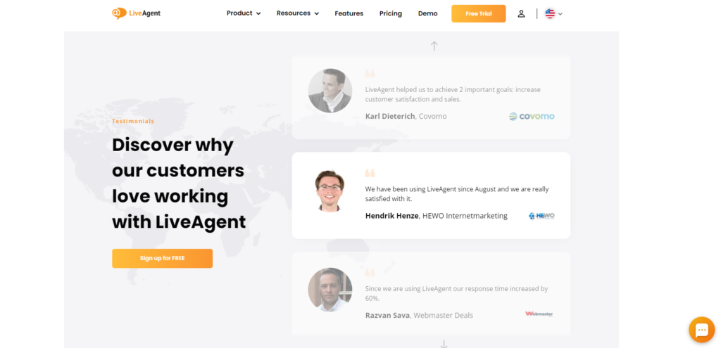
Another contact option is a chat box where people can reach out to you directly. The LiveAgent live chat feature allows users to talk to agents who can provide them with assistance.
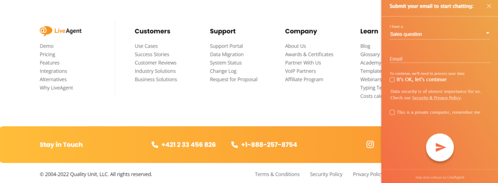
You simply need to choose a live chat button, customize the chat window, integrate it with your landing page, and start providing excellent support.
Including quotes from your customers, lists of benefits or features, and other formatting tricks will make your landing page easier to read. These elements can be used to break it up and make it less overwhelming.
Remember to remove all distracting navigational links and focus on getting visitors to take just one specific action.
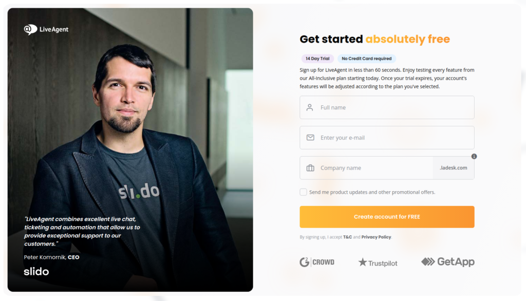
Short-form pages contain less information, which means fewer distractions that discourage users from submitting their details. When designing a signup form, remember to keep it as short as possible.
Adding a short form at the top of your page or as a pop-up is an easy way for visitors to take action and sign up. It will then be simple for people to take the first step of submitting their details instead of having them scroll all of the way down to the bottom of your page for the form.
Making your call-to-action buttons stand out is essential so that people can easily find them. You should choose colors that contrast with your page for increased visibility while also being appropriate as to not clash with other elements too much.
The text on the call to action buttons should be striking and action-oriented. Use words such as “get”, “reserve”, and “try” in place of boring ones such as “submit” or “enter”. Your action words contain specific text relating to your offer and use first-person speech to have the most impact, for example, “Start your Free Trial”.
Proofreading and editing the page is important so to ensure there are no spelling errors or grammatical mistakes that can make visitors question your credibility. The more professional your landing page appears, the greater the chance you have of someone signing up.
It’s also important to keep in mind that if something is confusing or complicated for visitors to understand, they are more likely to leave. Keep the content short, minimalistic, and to the point.
Make sure that your page loads quickly to keep visitors engaged with the information. The faster they can see all of it, the more likely you are to convert them into a lead or customer.
Test the design and content of your landing page by using Google Optimize for targeted, relevant landing pages that are engineered to drive more conversions and provide a better return on investment. You can integrate Google Optimize with other Google products such as Analytics, Google Ads, and Firebase for even more insights.
Before your page goes live, you should ensure that it is responsive and looks good on all devices, including mobile phones and tablets. Slow loading speeds are a conversion rate killer.
Having your landing page not appear correctly for people who are browsing from smaller devices can cause them to leave the site altogether.
To optimize content promotion on your landing page and keep visitors engaged, it’s important to use a variety of strategies. Use social media customer service software to engage directly with potential customers on popular platforms, building relationships and responding to inquiries. Implement effective email marketing campaigns to deliver personalized and compelling content that encourages visitors to explore your landing page further. Consider incorporating creative PR stunts and engaging viral content to generate buzz and attract a wider audience. By combining these different approaches, you can maximize the visibility and engagement of your landing page content, leading to greater success for your marketing efforts.

Finally, you should measure the results of your efforts to know what is working and what needs to be changed. The more information you have, the easier it will be for you to improve. Doing so will keep visitors coming back in the future.
How to know if my landing page is performing well?
Take a quick look at your overall review to get an idea of how well your landing page is doing. Here are a few questions to help you determine whether your landing page is effective or needs some improvement.
- Can visitors navigate through the website while still on your landing page?
- Does your entire landing page convey one clear, simple message that you want people to remember?
- Do you feel comfortable if this was how someone found their way onto the landing page for the first time?
- Have you tried tweaking fonts, colors, wording, or images to see what seems to work better for the readers?
- Does it convert visitors into leads?
- Will it help you achieve your main goal?
- Does it look professional and trustworthy enough that visitors would be willing to give you their contact details?
The more questions you can answer with a “yes,” the more likely your landing page is to be successful. However, this alone isn’t enough. You also need to track some data and metrics to get an idea of how well your landing page is doing.
Which metrics matter most for a landing page?
- Landing page views
This is the most basic of metrics that you will want to track. Did your landing page receive any traffic? And how many views did it get if so?
This is important because without visitors coming to check out what’s on offer, there is no chance of converting them into leads or customers. Variations in this metric can indicate that something has changed, which might have an impact on how successful your landing pages are at driving traffic.
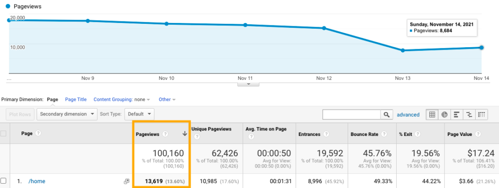
How to check the numbers? To pull up this report in Google Analytics, go to Behavior → Site content → All pages. After you reach the latter, you can choose specific landing pages and display the relevant data.
- Traffic source
What drove the traffic to your landing page? Did visitors find their way there from a social media post or via an email campaign, etc.?
Understanding where your visitors are coming from will help you know what is working and if there might be any new opportunities for promotion.
You can find data on your traffic sources in Google Analytics under Acquisition → All Traffic → Source/Medium.

- Goal Completions
Setting up goals in Google Analytics is the first step to tracking conversions on your landing page. With a target linked to your campaign’s thank-you page, you’ll be able to track the number of visitors and the number of people who took the desired action.
You can find completed goals by looking at the ones you set up recently in Conversions → Goals → Overview.

- Conversions by source
What is working to bring people in and what’s not? Did a social media post work for you, or was it an email marketing campaign that drove the most conversions so far?
Understanding the difference between each activity will help you make future decisions about prioritizing activities. For example, if an email marketing campaign has been performing much better than other efforts, this might suggest investing more time into sending out messages via this channel instead of promoting your page elsewhere.
- Conversions per session
What impact does each page or session make in terms of conversions into leads? This stat will tell you how long people are staying around and how much effort goes into converting them.
If you do not see any conversions then there may be problems with how keywords and topic relevance have been handled so far. You can fix it by adding more details about what’s being offered and addressing any concerns that potential customers might have.
- Visitors-to-Contact Ratio
How many visitors are coming in but not taking the next step? If you know that a large proportion of people who land on your page immediately leave, this means there is a problem somewhere.
It might be with how trustworthy and professional your landing page looks, or maybe something raises some doubts. There may also be problems with keywords and where they’re placed throughout the page, which could lead people away.
Suppose that less than 20% of your visitors convert into leads (this number may differ depending on the industry), then it’s time to get down to editing the landing page copy for better clarity. Make changes to the fonts and color of the CTA button, etc.
- Bounce Rate
How many people are coming to your site and immediately leaving? If this figure is high, then it’s time to start taking a closer look at the landing page itself.
The headline, images, and copy all impact how long visitors stay on your landing page, so take some time to think about any improvements that could be made.
You can find the bounce rate in the Behavior → Site Content → Landing Pages.

- Average Time on Page
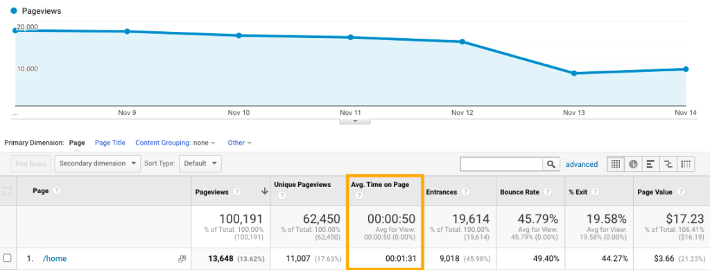
How long do people spend on your landing page? If people aren’t staying there long enough, it will be a challenge for you to convince them that what you offer could solve their problems.
You can use things like customer testimonials, case studies, and media coverage as social proof to help provide evidence of the benefits. If this isn’t helping or there don’t seem to be many visitors at all, maybe it would make more sense to focus efforts elsewhere until traffic increases organically through SEO activities instead.
Getting this data in Google Analytics is the same as finding your bounce rate. Navigate to Behavior → Site Content → All Pages.
- Pages per session
How many pages are people visiting on average? If this figure is low, it implies that visitors aren’t getting enough information before leaving, which also means there might be problems with the way keywords and topic relevance have been handled so far.
You can always provide more details about what’s being offered here by adding product descriptions, blog posts, or FAQs. Basically add anything at all to help answer the questions your customers may have.
To track pages per session for your landing page in Google Analytics and see the average number of pages visitors viewed when entering your site through your landing page, navigate to Behavior → Site Content → Landing Pages.

How to make an existing landing page attractive?
If you already have a landing page, do you need to rebuild it from scratch? The answer is “no,” but you do have to conduct a thorough landing page audit instead.
The regular analysis allows you to see what’s working and what needs to be changed.
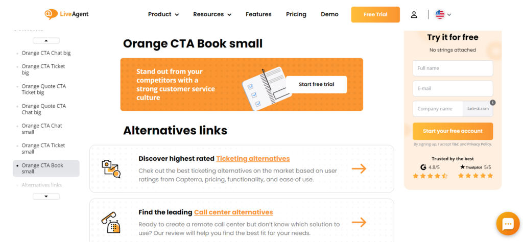
Performing an audit of your landing page should help you identify gaps. There are landing page optimization tools available on the market that can greatly help you with that task.
Such tools provide a set of features to measure overall performance, identify low-performing aspects, and improve your landing pages to drive more conversions. If you use a landing page builder, it’s easy to make some changes and adjustments after publishing your page.
The simplicity of these optimization tools makes them very appealing to users. Furthermore, many of them offer templates to help you improve your conversation rate, especially if you don’t know how to get started.
What should be done during a landing page audit?
A landing page audit is not an easy task to complete. It requires patience and attention to detail. The following things should be taken into account during the process:
- Make sure the content is written in a way that resonates with your target audience.
- Create a sense of urgency – the offer should be time-sensitive.
- Ensure the page is relevant to what’s being advertised and that people can find what they are looking for there.
- Use a heatmap tool to track where people are putting their focus and how long they’re spending on each form field.
- Keep the number of fields reasonable – the more options you have, the more difficult providing the required information will be.
- Confirm your offer with a headline and use sub-headings to explain it further or share your value proposition.
- Create an effective call-to-action that is descriptive, compelling, specific, and trackable.
- Design your landing page with the correct colors, sufficient contrast between the background and foreground, plus the right font type and size according to the results of A/B testing.
- Include testimonials to build trust with potential customers.
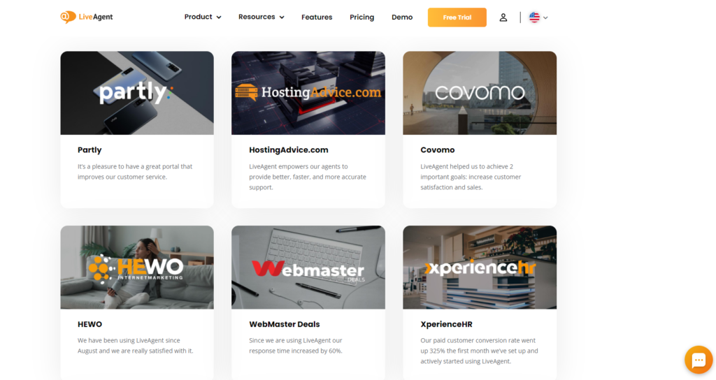
Let’s break down the whole landing page audit process into 7 steps:
- reevaluate your goals – Getting started requires a clear idea of what you want to achieve.
- learn as much as you can about your audience – If your conversation rate is dropping, it’s high time to take a closer look at your target group.
- understand what your visitors are doing – Where they are clicking, how long they stay, and what’s making them bounce from the page (landing page optimization tools help here).
- review the current content on your landing page – Check grammar, spelling, and whether it is informative enough.
- perform a functional and design analysis – Is the font too small or is the color of your CTA button not encouraging people to take the desired action? (changes will be much easier to implement if you use a landing page builder).
- reexamine the user experience – Can users easily navigate through the landing page?
- perform some A/B tests – See which changes work best.
During the landing page audit process, answer the following questions:
- Does my landing page meet the expectations set by the ad(s) that are sending traffic to it?
- Is my landing page free of unnecessary links?
- Have I added a page title to my landing page?
- Do I have a clear call to action that is noticeable?
- Is my landing page responsive and mobile-friendly?
- Is the headline of the landing page suitable?
- Are my ‘above the fold’ elements free from spelling and grammar mistakes?
- Does my landing page content provide value to readers?
- Is the content useful, interesting, or entertaining enough that visitors stay to read everything on the landing page?
- Am I being too “salesy” on my landing page – do visitors feel like it is promotional rather than a resource they can learn from?
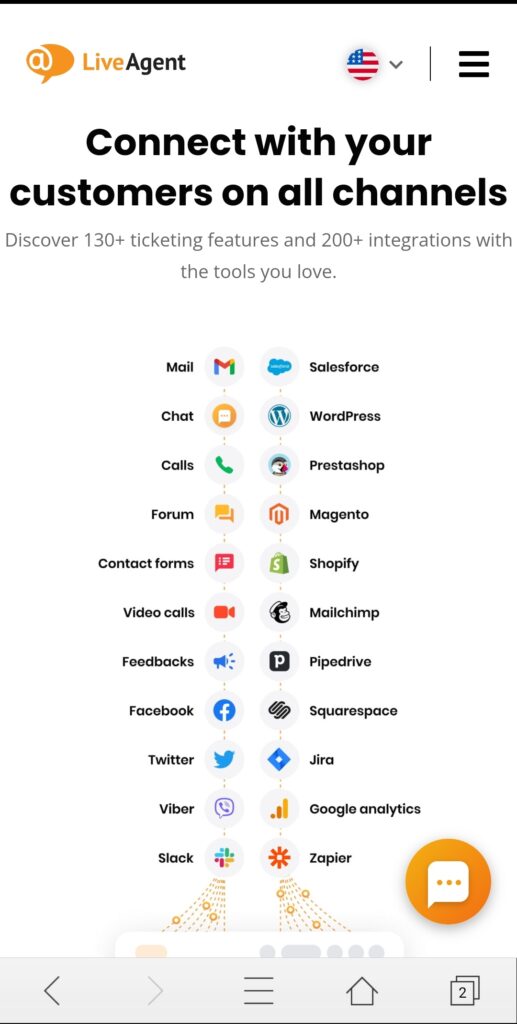
If you have answered ‘no’ to any of the above questions, it is time for immediate action.
Landing page reviews according to our checklist
Always look to improve user satisfaction by testing landing pages, analyzing the weak points, and making necessary changes.
How should you assess your landing page according to our checklist? Let’s look at a few examples that we analyzed in great detail below.
1. Biteable
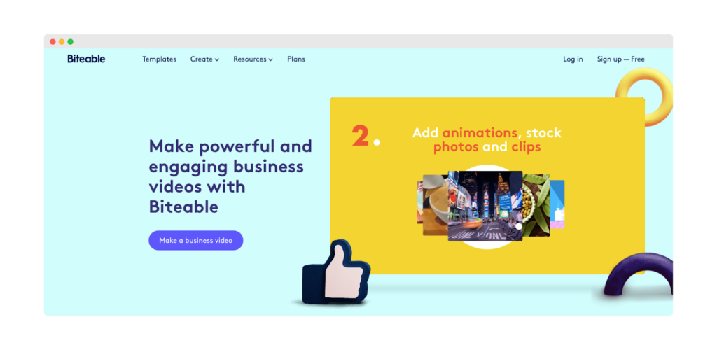
With its colorful and dynamic graphics, Biteable’s landing page stands out at first glance. As a tool for business videos, they make great use of this format on their site too. What about the other components?
✅ Content:
This landing page is full of information about the product and the benefits you can gain by using it. Also included is a short 5-step guide to creating business videos with their tool. Potential customers can thus quickly see how the product can shorten the process of creating videos.
✅ Style:
Biteable knows how to talk to their audience and interest people who are full of new ideas that they want to transfer to business videos. The copy is written in a professional style and full of tips, yet it is still easily understandable for everyone.
✅ Persuasiveness:
The main and sub-headlines build up curiosity in the audience, and the tool seems clear, easy to use, as well as helpful for making business videos from the very beginning. “Join in seconds. Create in minutes” is a compelling call-to-action that draws attention.
✅ Design experience:
The landing page design is appealing, has eye-catching graphics, and some elements are animated for a more dynamic experience.
Final Score:
Biteable’s site has a great example of a landing page that is likely to convert potential customers into clients. The amount of text there could be reduced a little bit, but all in all it has everything a good landing page should have: a persuasive CTA, animations, an appealing design, and videos.
2. LiveAgent
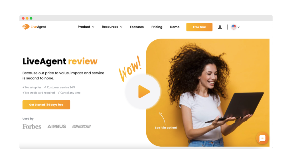
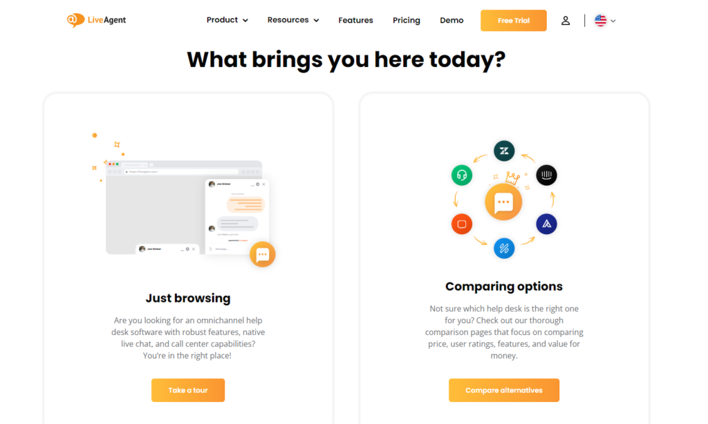
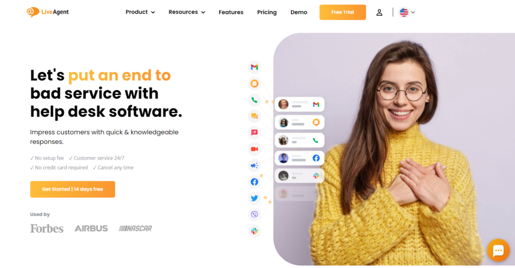
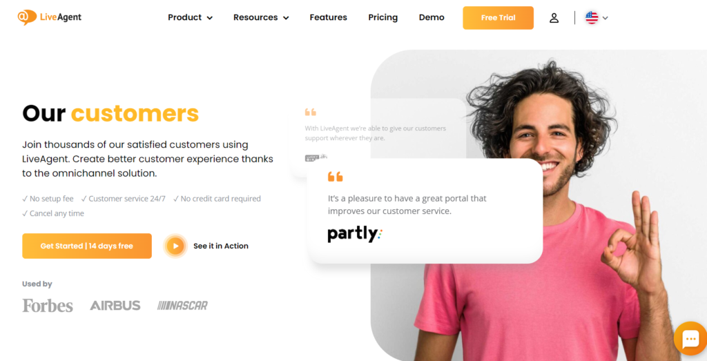
LiveAgent’s landing page is well-designed and easy to navigate through. Below the “above the fold” content is a short three-field form for starting a free trial, meaning that visitors can immediately take the desired action when they reach the site.
✅ Content:
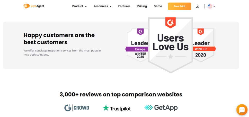
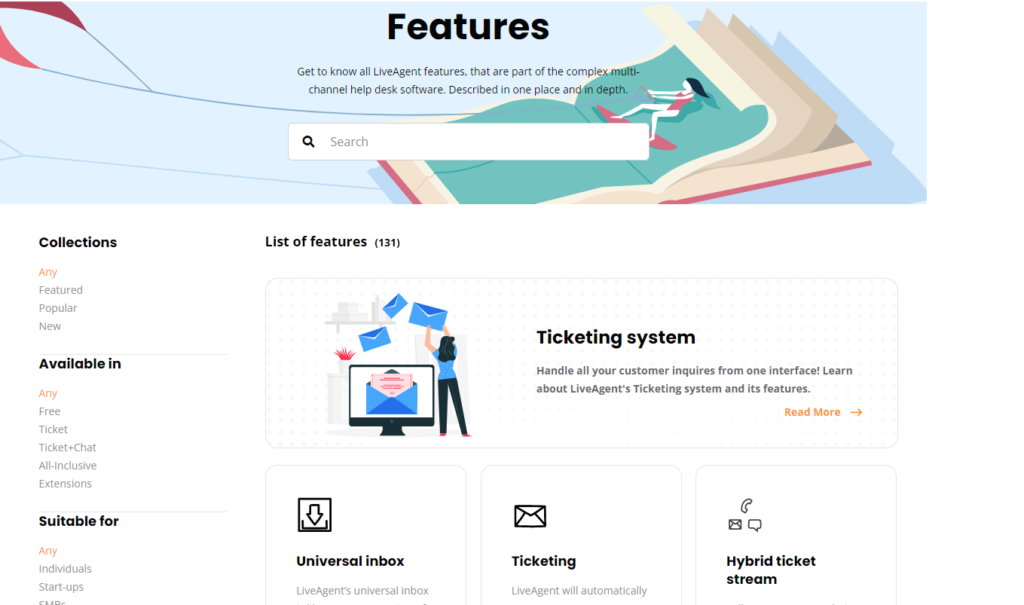
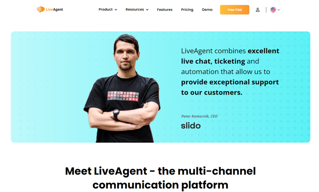
Immediate attention is drawn towards the button to play a short animated video explaining and demonstrating the tool, clearly illustrating 3 reasons why companies use LiveAgent. There are core features, testimonials, and reviews featured here, plus the landing page provides answers to the most common questions in an FAQ section.
✅ Style:
LiveAgent conveys the most critical information in a straightforward and accessible way. Moreover, it presents a trustworthy and professional image.
✅ Persuasiveness:
A pop-up appears on the landing page to encourage people to test out a free trial, but it isn’t intrusive. Instead of just showing the product’s features, the landing page highlights its benefits and shows how the tool can help people.
✅ Design experience:
The LiveAgent landing page consists of one background color, but also has a variety of graphics that give the site an appealing aspect. The site is well designed, so visitors can find the information they need quickly.
Final Score:
Despite having many elements, it is a good example of a landing page that isn’t overwhelming to users.
3. Kontentino
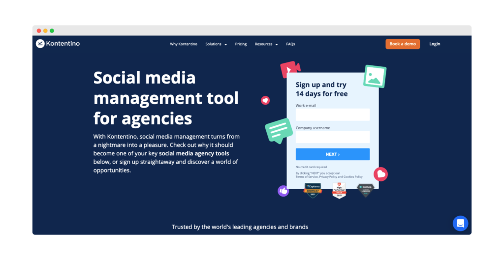
Even though this site doesn’t have any dynamic animations or other variety, it is a great example of a well-built landing page. There can be no confusion about what to do or what the page aims to accomplish.
✅ Content:
Most attention is focused on signing up for a free trial, and this is the first element that visitors see while the page is loading. The contact form is short and easy to complete.
A significant part of this landing page is “Try Kontentino and gain,” which visualizes five things that make Kontentino a great solution. Ultimately, each benefit is paired up with a CTA button.
✅ Style:
It’s a tool aimed at managers or professionals who are responsible for social media, and its main goal is to streamline their workflow. As such the landing page is maintained in a professional style that is not pushy, but rather informative.
✅ Persuasiveness:
This landing page aims to motivate people to use the product by showing them the benefits they can gain by doing so. This may well encourage visitors to give Kontentino a try.
✅ Design experience:
The landing page is divided into two main sections: one with a dark background and the other with a brighter one. It starts and ends with a CTA button and form to fill in, making the page easy to read and understand.
Final Score:
Kontentino’s landing page looks great, presents clear information and benefits, and convinces potential customers to try the tool out. When navigating through this page, you will not doubt that it encourages people to try out the solution. As a result, visitors know exactly what action to take without facing any distractions.
To sum up
- Take care about helpful, clear content
- Add cover photos from a design team
- Pay attention to the layout
- Include a note from an expert (if applicable)
- Feature a customer testimonial (if appropriate)
- Put product pictures
- Put product videos
- Present statistics from research
- Create comparison table
- Add FAQ section with Schema
- Add contact info
- Make use of quotes, lists, and other formatting tricks
- Design short forms
- Create compelling CTA buttons
- Be sure to proofread
- Optimize page speed – Google Web Vitals
- Conduct responsivity optimization
- Publish the content with CMS
- Promote the content
- Run A/B tests
- Measure results
Landing page metrics:
- Landing page views
- Traffic source
- Goal Completions
- Conversions by source
- Conversions per session
- Visitors-to-Contact Ratio
- Bounce Rate
- Average Time on Page
- Pages per session
Frequently Asked Questions
Is a landing page the same as a home page?
A landing page is not the same as a home page. A home page typically contains all pages of a website with links to each, while a landing page focuses on one specific product or service that you are advertising. Many companies like to use landing pages and homepages, since the goal is to keep visitors on an ‘information diet.’ However, some research has found that people who visit one overly information-rich site such as a home page tend to close the site and go elsewhere instead. That means you want someone who is not just clicking around your domain appreciating the content by chance, but because they went there specifically looking for it.
What are the benefits of using a landing page checklist?
Checklists are a remarkably effective way to take a systematic approach to achieving business goals. Moreover, once a checklist is created, its items can be completed from memory with less effort and more accuracy. The most classic example for most people is a ‘to-do’ list, which is used because it helps them remember what they may have blanked out or prioritized other tasks above. Such a list also then forces you to stay focused on all of your checked-off items before starting another one. The same goes for a landing page checklist. We recommend reviewing your site for the most common issues and then checking them off as you fix each one.
What do landing pages do for advertising and email marketing?
Landing pages are used for a variety of online marketing strategies. One popular approach is to use them as part of advertising and email campaigns, with the goal being to increase conversions from ad clicks or newsletter signups. As a result, you can quickly expand your email list.
Should I delete my existing landing page and make a new one according to the checklist?
If you already have a landing page that’s currently live and working for your business, then no. There may be parts of the page that could use some improvement, but if they’re already doing what you need them to do (i.e., converting well) then there is no good reason to make drastic alterations unless something changes with the product or service itself.
Will the landing page checklist be helpful for my page?
It’s hard to say without seeing your page specifically. Many different landing pages can be used for any business or product, so it depends on what you’re selling and why people should buy from you instead of the competition. The only way to know whether or not our checklist will be helpful for your site in particular would be by trying it out yourself. However, keep in mind that sometimes changing small things like fonts or adding a testimonial may not have much impact, yet more significant changes (like layout) could make all the difference depending on how receptive visitors are to them.
What is the best landing page checklist?
There isn’t one ‘best’ checklist because every company is different, and you need to choose the one that suits your needs best. Such a landing page checklist will help ensure that you haven’t missed anything and should reduce errors so that you can publish your pages faster. A good process also makes it easier to work on multiple projects at once instead of having to go back-and-forth between them all or constantly losing track of where you got to with each one.
How should I choose the right landing page checklist for my project?
You should try our free one out first to see what it’s like and how easy it is to use before spending any money on the paid version. Our free checklist is a great way to get started with the basics of what you need for your website.
What are the disadvantages of using a landing page checklist?
There aren’t any! It is simply an effective way to ensure that your pages do what you want them to do before moving on to other things.
Is it difficult to implement a landing page checklist?
No, they are actually very easy to use.
Discover the ultimate Graphic Design Checklist to create perfect designs that communicate effectively. Our step-by-step guide covers everything from design briefs and research to text optimization and final output, ensuring professional, high-quality visuals that meet deadlines and budgets. Ideal for business owners, graphic designers, and marketing teams, this checklist will help you produce standout graphics with ease. Visit now to elevate your design process!
New client onboarding checklist
Bringing a new client on board requires special attention. Ensure that nothing is missed by using our free new client onboarding checklist.
You will be
in Good Hands!
Join our community of happy clients and provide excellent customer support with LiveAgent.

Our website uses cookies. By continuing we assume your permission to deploy cookies as detailed in our privacy and cookies policy.
Want to improve your customer service?
Answer more tickets with our all-in-one help desk software. Try LiveAgent for 30 days with no credit card required.

Hello, I’m Andrej. We’re thrilled to invite you to an exclusive software demo where we’ll showcase our product and how it can transform your customer care. Learn how to achieve your business goals with LiveAgent or feel free to explore the best help desk software by yourself with no fee or credit card requirement.
Andrej Saxon | LiveAgent support team
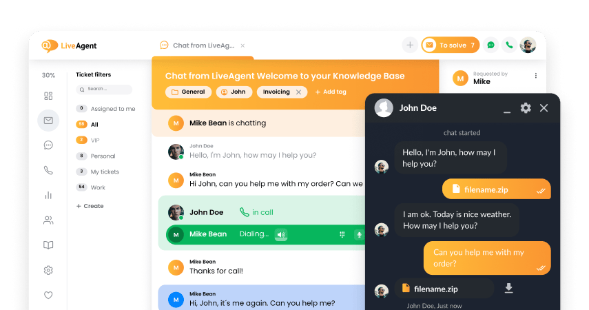
- How to achieve your business goals with LiveAgent
- Tour of the LiveAgent so you can get an idea of how it works
- Answers to any questions you may have about LiveAgent

 Български
  Čeština
  Dansk
Dansk  Deutsch
  Eesti
Eesti  Español
  Français
  Ελληνικα
  Hrvatski
  Italiano
  Latviešu
  Lietuviškai
  Magyar
  Nederlands
  Norsk bokmål
  Polski
  Română
  Русский
  Slovenčina
  Slovenščina
  简体中文
简体中文  Tagalog
  Tiếng Việt
  العربية
  Português